
Redesigned Interaid's second fuel marketplace to bring pellets, briquettes and firewood into one shopping experience. Firewood, a category the company had never sold, launched inside the existing system with its own filters and delivery logic.
Web-Plattform
Live Q4 2024

Role
· Solo UI/UX Designer
Team
· Product Manager
· 2 Developer
· 2 Leadership
Scope
Responsive web · Multi-product marketplace · System adaptation
Duration
5 months, concept to release
CONTEXT & PROBLEM
Bringing the newer HeizOel24 system across was not a simple reskin.
Three fuels, three delivery models, one of them a category with no precedent in the company. The open question was where that would break the existing flow.
Old Website

Outdated experience
The interface had fallen behind HeizOel24 in hierarchy, layout and component consistency.
Hidden product range
The main domain led with pellets and exposed no route to briquettes or firewood. Users entering through the brand could not discover the full marketplace.
Different delivery logic
Most products ship on pallets. Loose pellets arrive by tanker and require weight, vehicle and hose inputs. One generic calculator could not support both without adapting.
SYSTEM LOGIC
Shared core, variable product layer
The redesign did not create separate flows for each fuel. Navigation, calculator structure, offer cards and checkout stayed shared, while inputs, filters and comparison attributes changed with the selected product.
This allowed firewood to enter the marketplace as another product configuration rather than requiring a separate journey.

Same framework, different parameter sets
The same filtering framework is reused across the marketplace. Which controls appear depends on the selected product and delivery format.
Pellets
Bulk
Pellets
Bagged & Big Bag
Briquettes
Firewood
Quality
Group ordering
Payment method
Delivery date
Truck length
Hose length
Packaging
Shape
Length
Wood type
Pallet size
PRODUCT JOURNEY
Three doors, one marketplace
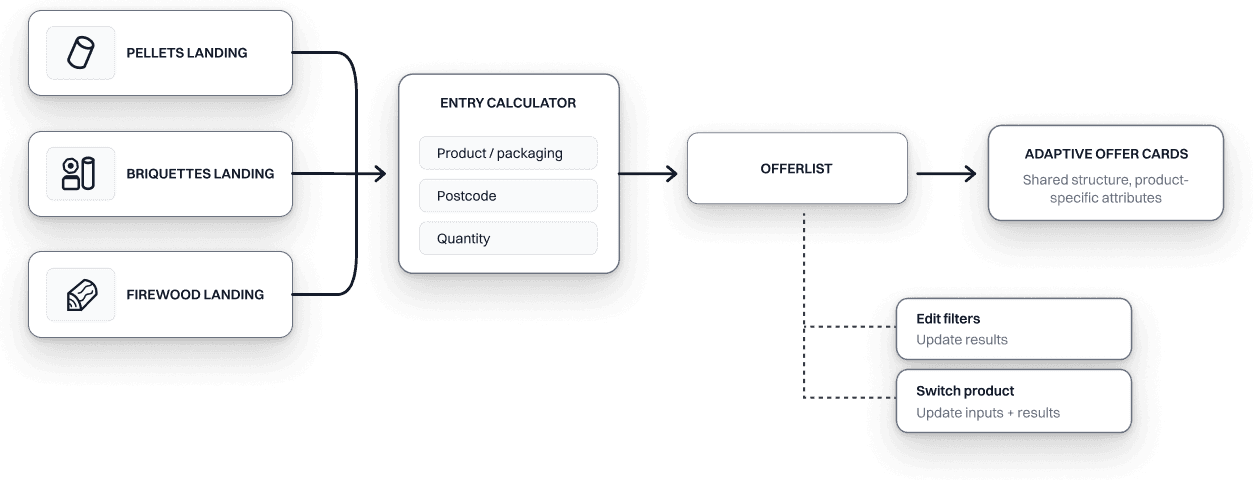
Landingpage
Start with known intent
Users typically arrive knowing which fuel they need. Each category therefore keeps its own landing page instead of adding an unnecessary product-selection step.
The main domain defaults to pellets, while persistent product navigation keeps briquettes and firewood discoverable.

Pellets Landing Page

Firewood Landing Page

Briquettes Landing Page
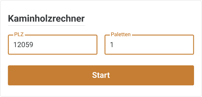
Calculator
Delivery determines the input model
Each product starts with its own calculator, but the input logic comes down to two states.
Pellets need three inputs because they support different delivery formats: packaging, postcode and quantity. Loose pellets are ordered by weight and delivered by tanker, while bagged pellets and Big Bags are ordered by pallet count.
Firewood and briquettes are always delivered on pallets, so their calculator only asks for postcode and pallet count. Product-specific choices such as wood type, shape or length are handled later as filters.

Offer list
Switch without restarting
Switching products remains deliberately lightweight. Product navigation stays inside the offer list so changing fuel updates the inputs in place instead of sending users back through the entry flow.
Compare within the right context
The offer list keeps one shared hierarchy for price, dealer, delivery and CTA. Only the attributes needed to compare the selected fuel change.
Users therefore learn one comparison pattern, while the content adapts to the product.
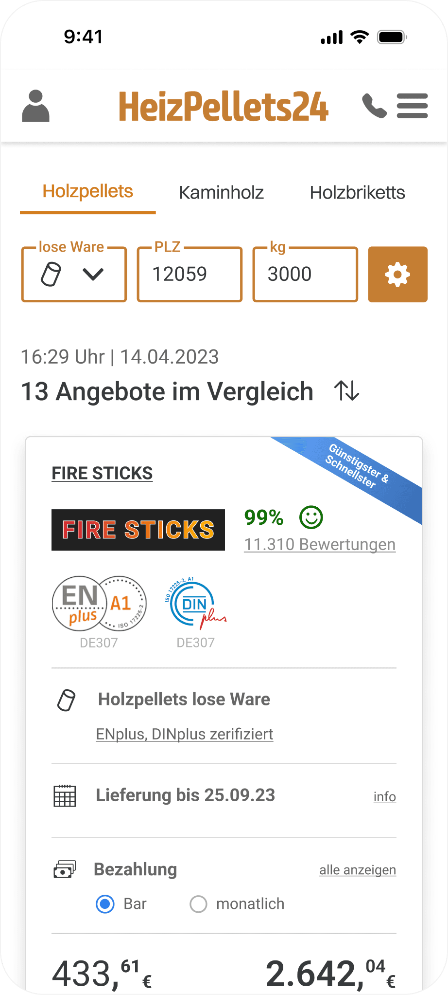
Product Change

Offercard Pellets bulk

Offercard Pellets bagged

DESIGN DECISIONS
Giving the primary action its own surface

Exploration
The calculator sat inside the hero, so its contrast depended on whichever image was behind it.

Final
Its own surface made contrast predictable, no matter which product image runs behind it.
Balancing brand continuity and contrast
I proposed moving away from the existing orange to give HeizPellets24 a more distinct identity while keeping the shared UI language intact. The change also improved contrast: the original orange measured 1.86:1, while the proposed brown reached 4.52:1.
Stakeholders preferred stronger continuity with the existing brand, so the shipped color settled at 3.27:1. Body text moved to a neutral dark, while button-label contrast remained below the WCAG AA threshold.
OLD · 1.86:1

Headline, body and button label all below the threshold.
PROPOSED · 4.52:1

The brown I proposed. It cleared body text as well.
FINAL · 3.27:1

Headline and icons pass. Body text moved to a neutral dark, and button labels still fall short.
OUTCOME
Live since Q4 2024. Firewood is orderable as its own category.
New category shipped
Firewood launched with a newly defined parameter and filter model inside the existing marketplace architecture.
Core system reused
Navigation, forms, offer cards, checkout and foundational UI patterns carried over from HeizOel24 instead of being rebuilt for each category.
Delivery logic per product
Each fuel keeps its own input model: pallets, weight, or length. The checkout stays one path.
REFLECTION
What I learned
The orange button label ended at 3.27:1. Below the target, above the previous 1.86, and accepted as a stakeholder decision to keep the brand contrast. I would carry that one differently next time: the contrast question needed to be raised while the palette was still open, not after it was signed off.
