One App.

Two Use Cases

HeizOel24 helps homeowners compare prices and order heating oil. meX, an optional tank sensor, adds live fill level, consumption and estimated range to the app. Without meX, users mainly compare prices and order. With it, they can also monitor their tank and know when to reorder. The existing app had become technically outdated and could no longer receive updates. The required rebuild became an opportunity to rethink an experience that still behaved more like a website than an app.

iOS and Android

Live since Sep. 2025

Role

· Solo UI/UX Designer

Team

· Product Manager
· 2 Developer
· 2 Leadership

Scope

Hybrid app, web core · End-to-end redesign · IoT device onboarding
· Real time status design

Duration

~3 months · design to first release

PROBLEM SPACE

What Needed to Change

The technical rebuild was fixed, but the UX redesign was not predefined. The previous app supported its core functionality, but its website-like structure no longer worked as a modern mobile experience. I reviewed the existing experience and proposed where the redesign could improve the product rather than simply recreate it. Three main pain points stood out: navigation, meX onboarding and visual hierarchy.

PROBLEM SPACE

What Needed to Change

The technical rebuild was fixed, but the UX redesign was not predefined. The previous app supported its core functionality, but its website-like structure no longer worked as a modern mobile experience. I reviewed the existing experience and proposed where the redesign could improve the product rather than simply recreate it. Three main pain points stood out: navigation, meX onboarding and visual hierarchy.

01

Structure & Navigation

The app largely followed web-app conventions, without a clear starting point or persistent mobile navigation.

02

Onboarding

Setting up meX required users to watch the meX device LEDs, remember their state and select the matching options (red or green) in the app.

03

Dashboard

The app lacked a central place to surface the most important information. With meX connected, tank status, consumption and key actions were spread across the experience instead of being prioritised in a dedicated mobile dashboard.

03

Dashboard

The app lacked a central place to surface the most important information. With meX connected, tank status, consumption and key actions were spread across the experience instead of being prioritised in a dedicated mobile dashboard.

01

Structure & Navigation

The app largely followed web-app conventions, without a clear starting point or persistent mobile navigation.

02

Onboarding

Setting up meX required users to watch the meX device LEDs, remember their state and select the matching options (red or green) in the app.

03

Dashboard

The app lacked a central place to surface the most important information. With meX connected, tank status, consumption and key actions were spread across the experience instead of being prioritised in a dedicated mobile dashboard.

STRUCTURE & NAVIGATION

Mobile-First Structure

The old app inherited its structure from the website, where navigation and content were spread across several pages. Adapting this structure for mobile meant deciding which tasks deserved direct access and which could remain secondary. I introduced a dedicated dashboard and an iOS-style tab bar to make the app’s core entry points persistent and easier to reach.

STRUCTURE & NAVIGATION

Mobile-First Structure

The old app inherited its structure from the website, where navigation and content were spread across several pages. Adapting this structure for mobile meant deciding which tasks deserved direct access and which could remain secondary. I introduced a dedicated dashboard and an iOS-style tab bar to make the app’s core entry points persistent and easier to reach.

BEFORE

AFTER

App Dashboard

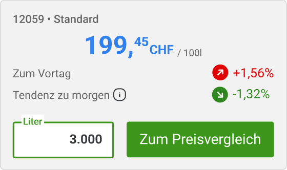
A dedicated dashboard created one clear starting point. The pricing module brought the existing calculator logic into the app, allowing users to adjust quantities without leaving the dashboard.

Tab Bar

The tab bar gave the app’s core tasks persistent entry points, while secondary pages remained accessible through the top navigation.

ONBOARDING

Enhancing the meX setup experience

Setting up meX happens in two stages: connecting the sensor to Wi-Fi and configuring the tank dimensions needed for accurate fill-level calculations.

ONBOARDING

Enhancing the meX setup experience

Setting up meX happens in two stages: connecting the sensor to Wi-Fi and configuring the tank dimensions needed for accurate fill-level calculations.

Part I : Pairing the Sensor

Customer Support identified the sensor setup as a recurring source of confusion. In the existing flow, users had to read the device LED, remember its colour and select the matching option in the app. My first iteration still followed this logic closely. When I reviewed it with the developer, I challenged the assumption that verification had to run continuously. We found that the app could instead check the connection on demand and return a clear success or failure state itself. This removed the manual interpretation step entirely.

AFTER

BEFORE

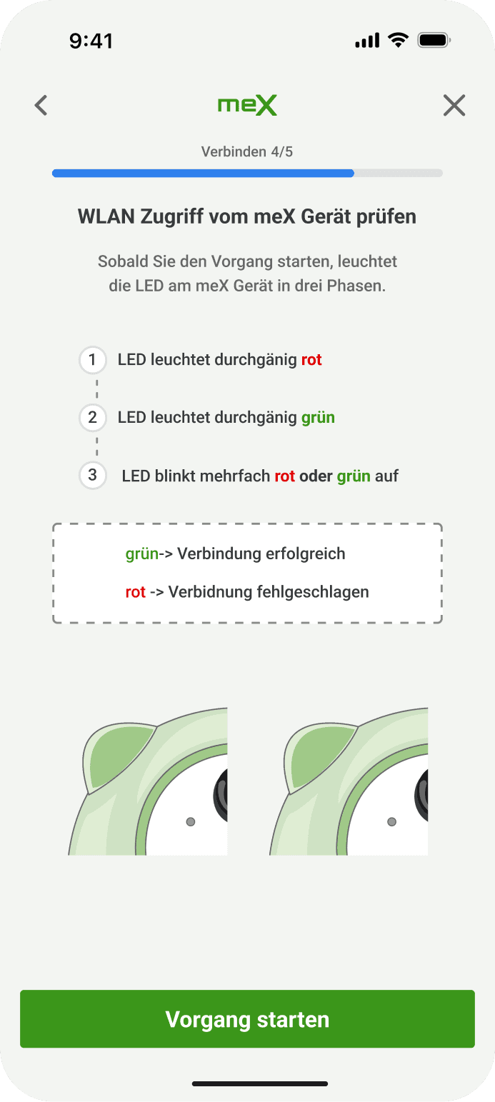
Explained Before It Starts

Both LED states are explained before validation begins, so users know what to expect before starting the connection.
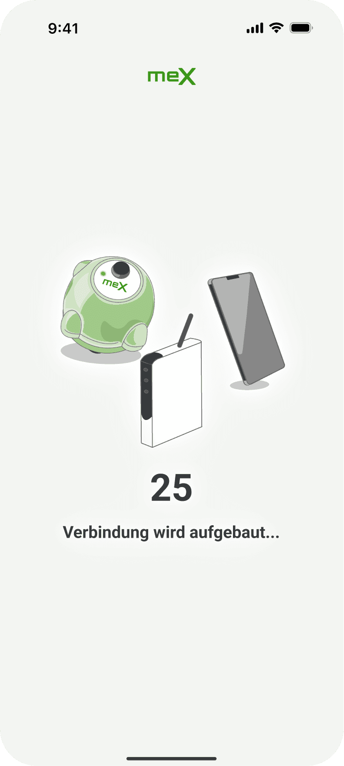
The App Does the Counting

Instead of relying on users to interpret the device state, the app checks the connection itself and shows progress while validation is running.
Dedicated Result States

The connection check ends in a dedicated success or failure state, removing manual interpretation and confirmation.

BEFORE

AFTER

Part II : Configuring the Tank

Previously, several tank measurements were collected on one screen. Once the numeric keyboard opened, parts of the form were pushed out of view, forcing users to scroll within the screen while measuring the physical tank. I split the setup into focused steps with one measurement per screen, keeping the relevant tank dimension, input and guidance together.

A Tank You Recognise

Before entering anything, users see the complete tank and all required dimensions, establishing the task before it is broken into individual steps.

One Input per Screen

Each screen asks for one measurement only, keeping the highlighted area, input and guidance together. This reduces visual complexity and keeps attention on the current task.

ADAPTIVE EXPERIENCE

Once meX Is Installed

Installing meX changes the dashboard priority, not the app structure. Live tank data becomes the primary focus, while pricing and ordering remain accessible through the same navigation.

Status at a Glance

The meX module became the dashboard's primary status element, showing fill level and range at a glance while keeping price comparison accessible. The current tank level also remains visible in the navigation.

One-Tap Overview

The former dashboard tab became a direct shortcut to the offer list, keeping the existing ordering flow one tap away.

Device Management

Settings and additional sensors remain accessible through a dedicated meX entry, without adding complexity to the primary navigation.

ITERATIONS & TRADE-OFFS

What the first release revealed

After the initial redesign launched, two layout issues became visible on smaller screens. The meX module pushed pricing and its CTA below the fold, while three-digit CHF prices made the pricing module too dense. Both problems came from limited vertical and horizontal space, so I addressed them together in the next iteration.

ITERATIONS & TRADE-OFFS

What the first release revealed

After the initial redesign launched, two layout issues became visible on smaller screens. The meX module pushed pricing and its CTA below the fold, while three-digit CHF prices made the pricing module too dense. Both problems came from limited vertical and horizontal space, so I addressed them together in the next iteration.

01 Initial Release

The initial release worked well on larger screens. The meX module and pricing content both fit comfortably within the viewport, so the space constraints were not immediately apparent.

Shipped September 2025. Color limited to the tank graphic.

02 Small-Screen Issues

The same layout became problematic on smaller screens. The meX illustration pushed pricing and its CTA below the fold, while three-digit CHF prices left too little horizontal space for the full pricing layout.

The price CTA fell below the viewport on small screens

Layout took too much space

Layout breaks with larger prices and CHF.

03 Refined

Both issues came from the same space constraints, so I treated them as one iteration. meX became a compact, lightly tinted card, while the pricing module kept its footprint but used a tighter internal layout. Pricing and its CTA now fit within the initial viewport, including with longer CHF prices.

meX as a compact, tinted card, with the price module tightened.

Moduel in block and tighter layout

Price, trend and action in one block instead of three separate lines.

OUTCOME

Setup Became Easier to Support

The redesigned app launched on iOS and Android in September 2025. After release, Customer Support reported fewer questions around meX setup. Store feedback remained positive, while device returns also moved in a positive direction, although they cannot be attributed to the redesign alone.

OUTCOME

Setup Became Easier to Support

The redesigned app launched on iOS and Android in September 2025. After release, Customer Support reported fewer questions around meX setup. Store feedback remained positive, while device returns also moved in a positive direction, although they cannot be attributed to the redesign alone.

CUSTOMER FEEDBACK

Store reviews stayed positive after the release.

4,1 → 4,3 average rating in the six months following release

CUSTOMER FEEDBACK

Store reviews stayed positive after the release.

4,1 → 4,3 average rating in the six months following release

SUPPORT FEEDBACK

Reported fewer calls asking for help with setup


OPERATIONAL SIGNAL

Fewer meX devices came back as complaints.

10% fewer returns in the same six month period.

OPERATIONAL SIGNAL

Fewer meX devices came back as complaints.

10% fewer returns in the same six month period.

CUSTOMER FEEDBACK

Store reviews stayed positive after the release.

4,1 → 4,3 average rating in the six months following release

SUPPORT FEEDBACK

Reported fewer calls asking for help with setup


OPERATIONAL SIGNAL

Fewer meX devices came back as complaints.

10% fewer returns in the same six month period.

Device returns move in waves for reasons outside the app, so I am reporting what the teams observed rather than a result I can attribute to the redesign.

Device returns move in waves for reasons outside the app, so I am reporting what the teams observed rather than a result I can attribute to the redesign.

REFLECTION

Integration Mattered More Than the Feature

The hardest part was not designing meX itself, but integrating it into a product people already knew. Balancing occasional ordering with regular tank monitoring shaped decisions across navigation, hierarchy and onboarding. The release also showed that some layout constraints only become visible in the real product, reinforcing iteration as part of the design process rather than something that ends at launch. I also created the meX illustrations myself, using them to make the technical setup easier to follow while giving the experience a distinct visual character.

REFLECTION

Integration Mattered More Than the Feature

The hardest part was not designing meX itself, but integrating it into a product people already knew. Balancing occasional ordering with regular tank monitoring shaped decisions across navigation, hierarchy and onboarding. The release also showed that some layout constraints only become visible in the real product, reinforcing iteration as part of the design process rather than something that ends at launch. I also created the meX illustrations myself, using them to make the technical setup easier to follow while giving the experience a distinct visual character.

View Next Case Study →