
Modernizing a business-critical ordering journey without breaking the trust existing customers relied on
HeizOel24 is one of the largest heating oil marketplaces in the DACH region. 58% of orders come from returning customers spending several thousand euros at a time, so familiarity mattered more than novelty. I rebuilt offer comparison, checkout and sign-in as the sole designer on the product.
Role
· Solo UI/UX Designer
Team
· 1 Product Manager
· 2 Developer
· 2 Leadership
Scope
Responsive web · End-to-end UX/UI redesign · Information architecture · Checkout · Authentication · Shared components
Duration
~ 7 months · concept to release
RESEARCH & FINDINGS
Understanding the Existing Experience
HeizOel24 had no dedicated research function or budget. I worked with four available sources and cross-checked findings before turning them into design decisions.

These four issues shaped the priorities for the redesign that follows.
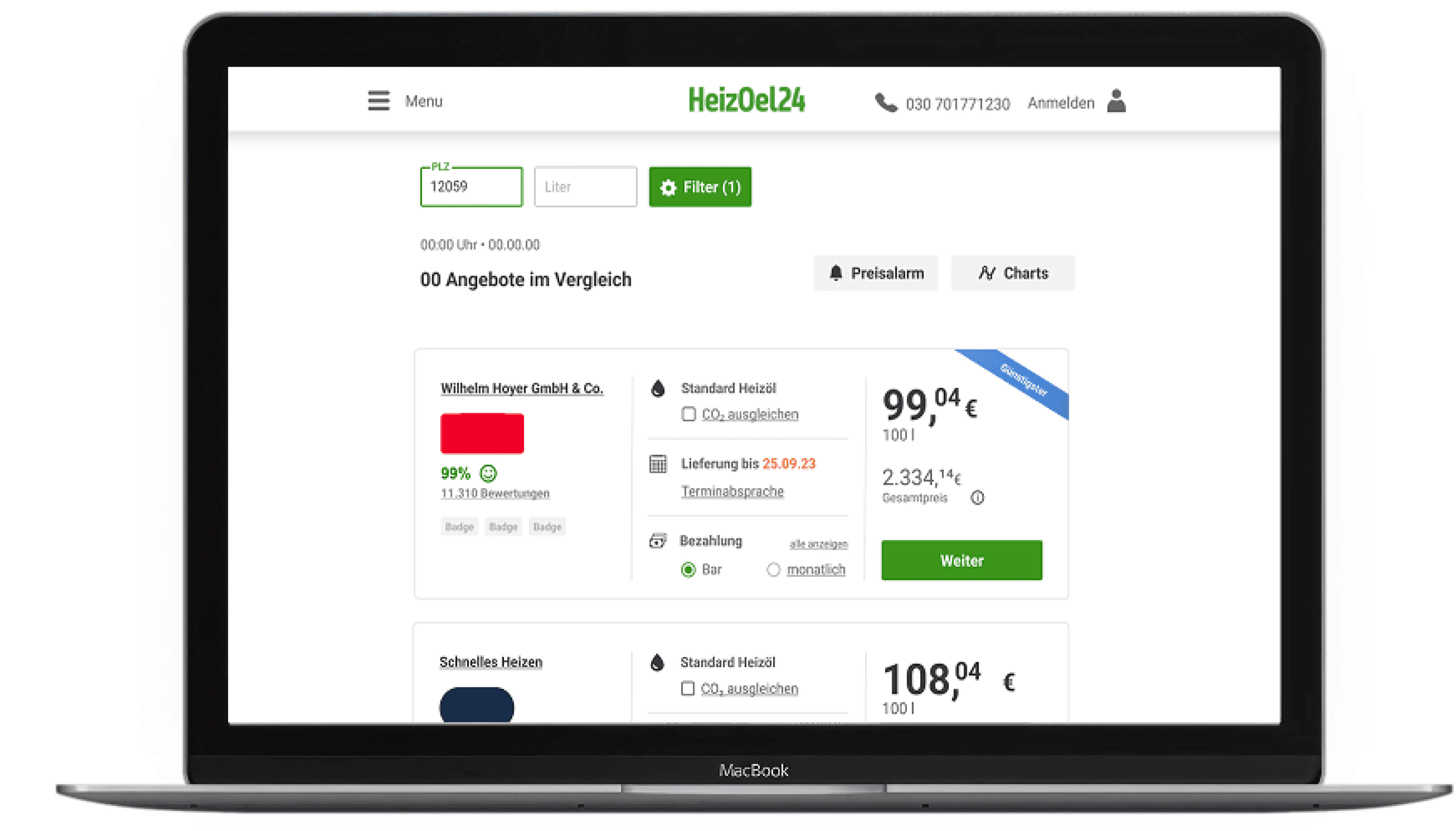
BEFORE

four accent colors, three competing green elements per card
AFTER

organized card template, price leading the card, and filters collapsed into a single control
The redesign shipped responsive. Comparisons are shown on desktop, because no screenshots of the old mobile views were kept.
The Calculator
The calculator had two competing actions even though results already updated automatically. I removed the redundant refresh button and kept one clear filter action. A live result count and timestamp make the system response visible.
BEFORE

Added a live result count and timestamp so offers visibly stay current.
AFTER

Removed the duplicate button, one clear "Filter" action instead of two competing CTAs.
BEFORE

Replaced generic checkmarks with icons
Prioritized price: through typography, whitespace, and color
AFTER

Trust Badges: credentials now stand out
Payment:
one tap to switch
The Offer Cards
The original cards had no hierarchy. Accent colors were overused, checkmarks carried little meaning, and recordings showed repeated clicks on the lowest price label, which was not interactive.
I gave the card a clear structure. Status stopped looking like controls, and trade-offs became comparable at a glance.
New Feature: Preferred Delivery Date
Leadership had wanted delivery scheduling for a long time, and the redesign was the first flow open enough to add it. We built it last, right before launch.
Dealers had always entered date-dependent prices with their offers, but none of it reached the customer. The scheduling link opened a static dialog saying the dealer would get in touch. A calendar now shows those dates and their price differences inside the flow. Delivery became a decision customers make themselves.


BEFORE

Structured information:
Grouped related information into clear sections.
Highlighted priorities: Important details stand out
Price: moved directly above the purchase button
AFTER

Offer Summary
The old summary listed everything at equal weight, so the price sat in the beginning. I grouped related information into sections and moved the total directly above the purchase button.
Considered and rejected: one-click purchasing. The product manager and I agreed that at four to five figures, customers need a last look.
New: Context-aware Login
In the old flow, the selected offer disappeared the moment users reached sign-in, with no confirmation they were still buying the same thing at the same price. The offer now stays visible throughout login, and guest checkout moved out of the small print into a visible option.The competitor scan showed this pattern was common in high-volume checkouts, which made it easier to argue for changing a step existing customers already knew. No context loss, and one less reason to abandon at the last step.
BEFORE
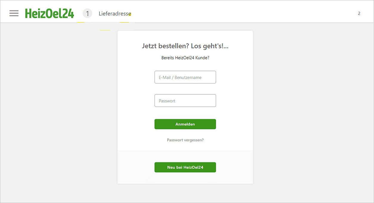
No context loss. The selected offer stays visible through login.
AFTER: Context-Aware Checkout Login

Reduced friction & clearer orientation
Sign-in was a major source of support requests. Customers forgot passwords, created duplicate accounts, or gave up at a screen that asked them to choose between signing in and registering before it knew who they were. I rebuilt authentication around account status. Users start with a single email field, then see only the next relevant step: continue as a new customer, enter a known password, or receive a login link.
Failed passwords route straight to email access instead of a recovery loop.

Four states, one entry point
Email-first Entry

Users begin with a single email field instead of choosing between sign in and registration.
Optional Password

New customers can continue their purchase immediately and decide later whether to create a password.
Passwordless Login

Returning customers without a password receive a secure login link via email.
Instant Recovery

Replaced password recovery with instant email access, helping customers complete their purchase instead of abandoning it.
Measured over a 12-week post-launch window and provided by the marketing team. Percentages without a range are relative changes against the prior baseline, not percentage points. Heating oil demand is highly seasonal and the launch landed in December, past the peak of the buying season, which likely affects these numbers.
Live since December 2023, with every flow shown here shipped. Still the default ordering experience today, unchanged.
SHIPPED AND REMOVED
What did not work
Midway through, I built an order assistant that guided customers through the flow step by step. It was requested internally and shipped alongside the redesign.
It was barely used. Customers who order heating oil twice a year already know the steps, and the assistant is no longer on the site. The flow itself was the thing that needed fixing.
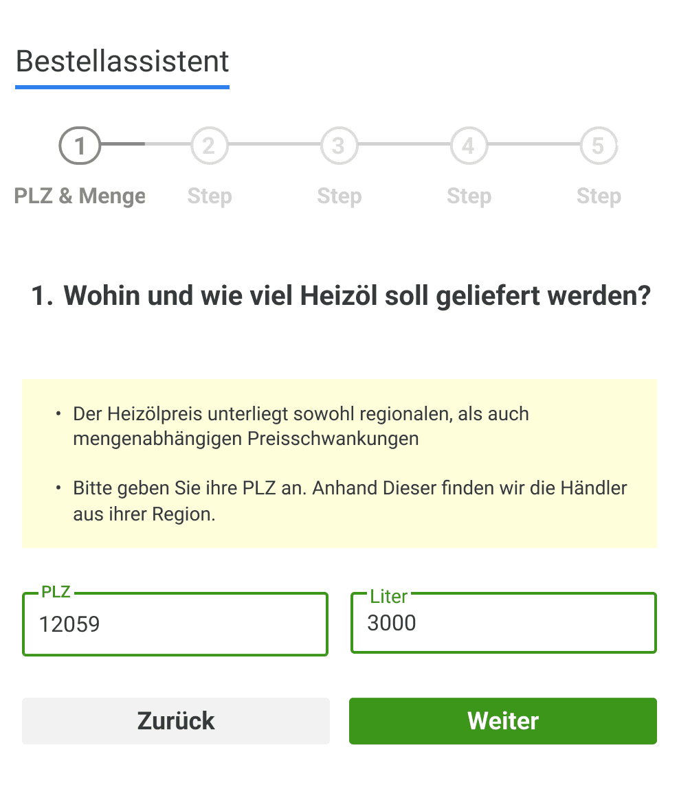

Bestellassistent Step 1 +2
CHOOSING TRUST OVER CHANGE
One Idea That Never Shipped
Fake portals copy the HeizOel24 name or misuse its identity to sell heating oil that never arrives. The company already warned customers about these scams. I explored a more modern landing page with lifestyle photography and a new hero layout. But making a familiar entry point suddenly look different risked creating exactly the distrust we were trying to prevent. I proposed leaving the landing page untouched, the product manager agreed, and the redesign stayed inside the ordering flow.

Live landing page. Unchanged.

Drafted concept, never shipped

BUILDING CONSISTENCY
The Shared Components
I was new to the product and mapped the full flow before changing anything. The order process came first, then login. Buttons behaved
differently depending on where they appeared, and validation states were built new each time. I standardized the recurring pieces as I went: typography, color, spacing and iconography, then buttons, forms, dialogs and validation states. The result was a first component base the team could reuse and adapt, short of a full design system. Later screens reused what was already defined.
Componets
Visual Language
Product pattern
Challenge Familiar Patterns
At first I stayed close to the existing flows to avoid disrupting familiar behavior. The order assistant showed the limit of that. Adding guidance on top of a confusing flow does not fix the flow. The best improvements came from balancing familiarity with meaningful change.
Design Beyond the Happy Path
Twice in this project, the fix was not new functionality. Dealers had already entered the delivery dates, and the system already knew which offer the customer had selected. The interface dropped both. Authentication turned out to be the same kind of problem, less a login screen than a place where context got lost.
Step Back Regularly
Working as the only designer made it easy to go blind to familiar patterns. Discussing alternatives with the product lead became as valuable as designing the interface itself.
